1VoiceOver
Every screen in Dawnlet on iPhone and iPad is written to be read aloud, not just looked at.
- Every control has a name. Buttons that are only an icon say what they do: the arrows that page through time read "Previous month" or "Next day", the search field's clear button reads "Clear search", and a Save in progress reads "Saving".
- Checks say where they stand. Checking off a habit or a todo is a button whose value is "Completed", "Not completed" or "Skipped", with a hint saying what a double-tap will do. Filters, selected days and the choices in Plan My Week and Plan My Month are read as selected when they are.
- Headings are headings. Section titles in every module list, in Settings and in the insight cards are marked as headings, so the VoiceOver rotor's Headings setting jumps from one section to the next.
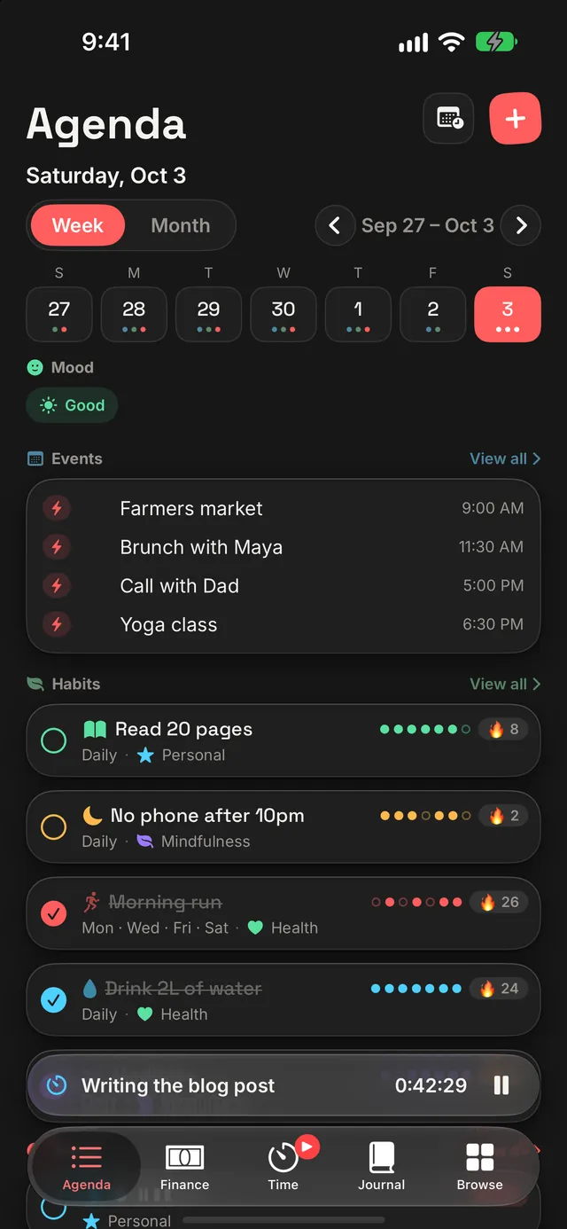
- Rows read as one sentence. Things that are drawn as a cluster of small shapes are read as one element: a habit's week strip is "5 of 7 days this week", a streak is "3-day streak", and a day in Agenda's calendar reads like "Saturday, October 3, Today, 2 events, 3 todos, Mood: Good". Purely decorative icons, separators and chevrons are skipped, so you don't hear them between the words that matter.
- Charts can be heard. The bar charts in Finance, the month insights and Reports are one element with a spoken summary, and each offers an Audio Graph: use the rotor's Audio Graphs option to explore the values one by one or play the chart as rising and falling tones.
- Things that appear on their own are announced. Confirmation toasts ("… deleted."), the offline notice and a newly earned badge are spoken as they appear, so you don't have to go looking for them.
- A dense grid is one control. A habit's month of small squares is a single adjustable element: swipe up or down to move between days, and double-tap to check the one you're on.
The running timer's Live Activity on the Lock Screen and in the Dynamic Island reads its activity and state together ("Deep focus, running"), its buttons read "Pause timer", "Resume timer" and "Stop timer", and a paused time is spoken in words. Dawnlet's tips are Apple's own tip views, which carry VoiceOver themselves.
2Voice Control
Every button that is only an icon on screen has a word you can say, and where the name VoiceOver reads is a long sentence, Dawnlet also answers to the short thing people actually say. Turn on "Show names" in Voice Control to see them, or "Show numbers" to tap anything by its number.
- Short commands. "Tap Add" (or "New", or "Plus") for the "+" on any screen, "Tap Previous" / "Tap Next" (or "Earlier" / "Later") for the month, week and day arrows, "Tap Today", "Tap Insights", "Tap Recurring", "Tap Manage", "Tap Plan", "Tap Share" on a report and "Tap Notifications" or "Tap Settings" on Browse. The longer names still work too ("Tap Add to Finance", "Tap Previous month").
- Timers. "Tap Pause", "Tap Resume" and "Tap Stop" work on the running timer wherever it shows - the Time tab and the bar above the tabs - and "Tap Start Reading" (or "Play Reading") starts an activity by name.
- Rows by their title. Habits, todos, events, places, books, movies, meals, journal entries, transactions, sessions, people and search results answer to their title alone, rather than to everything the row says. A todo's check answers to "Check" plus its title ("Tap Check Buy milk"), and a habit to its name or "Check" plus its name.
- Days and cards. A day in Agenda's week or month answers to its date or weekday ("Tap October 3", "Tap Saturday"), a mood to "Tap Mood", and Browse's cards and weekly tiles to their module ("Tap Streaks", "Tap Badges", "Tap Habits").
- Star ratings. With Voice Control on (and VoiceOver off), each star is its own button - "Tap 4 stars" sets a rating of four.
3Text, colour & contrast
Larger Text
Dawnlet's text follows the text size you set in Settings → Accessibility → Display & Text Size (or Control Center's Text Size), including the titles at the top of each screen, and changes with it while the app is open. From version 1.4.0, the larger accessibility sizes (Settings → Accessibility → Display & Text Size → Larger Text) also change the layout so nothing is squeezed or cut off:
- Rows stack. In habits, todos, events, transactions, journal entries, notifications, places, books, movies, meals and time sessions, a long title wraps across the whole row, and the time, amount, streak or rating moves onto its own line below it.
- One per row. Browse's weekly glances, streaks and Everything list, the insights' stat tiles, Finance's income, expenses and net, and the mood check-in on the Journal tab go one to a row instead of side by side.
- Headers stack too. The Insights switch sits above the month, the Week/Month switch above Agenda's dates, and "View all" under each Agenda section's name.
- The "+" menus grow to fit. Add to Agenda, Plan Ahead, Mark Complete, How was it? and the other small menus become a list - each choice's icon beside its name - in a sheet as tall as its content, which scrolls if it needs to.
- Big numbers grow, within limits. The running timer, a transaction's amount and the unread count on the bell get bigger with your text size, up to a size that still fits the screen.
Two places keep their size on purpose: the bar above the tabs (the running timer or what's up next) stops growing at the largest standard size, like the tab bar itself, and the calendar's day numbers shrink a little rather than break onto two lines. Both say the same thing at full size elsewhere - on the Time tab and in the day's list.
Dark Mode and the Appearance setting
Dawnlet follows your device's Light or Dark setting by default. To pick one for Dawnlet alone, open Settings → Appearance and choose System, Light or Dark.
Contrast
- Readable coloured text. Dawnlet's module colours are bright, which works for icons and bars but not for words. Wherever one of them colours text (an amount, a "View all", a label on a pill, a back button), Dawnlet draws it in a deeper shade of the same colour so it meets the WCAG AA level for text - 4.5:1 - in both light and dark mode. Secondary grey text was darkened for the same reason.
- White text on colour. Buttons, the selected day, the Week/Month switch and other filled controls with white text on them use a deeper shade of their colour, so the white text also clears 4.5:1.
- Icons, stars and charts. Checkboxes, filled rating stars, selection ticks, chart bars, the dots of a habit's week (a filled dot for a day done, a ring for a day not) and the icon tiles with a white symbol on them are drawn in a shade that clears the 3:1 WCAG asks of graphics - so a gold star, a sky-blue bar or a mint day-ring no longer fades into a white card. The same rules apply to the Home Screen widgets, the timer on the Lock Screen and the Apple Watch app.
- Increase Contrast. With Settings → Accessibility → Display & Text Size → Increase Contrast on, coloured text, filled controls and graphics go further still (coloured text to 7:1), and the main text, secondary text and card borders switch to stronger versions.
- Differentiate Without Colour (from version 1.4.0). Most of Dawnlet already says things in more than colour - a tick, a strikethrough, an "Overdue" label, a + or - on an amount. Where colour was the only clue, turning on Settings → Accessibility → Display & Text Size → Differentiate Without Colour adds one: the dots under each day in Agenda's calendar become the icons of the modules they stand for; the slices of a breakdown bar (Finance, Time, Insights and Reports) and their legend rows get matching numbers, each drawn in black or white, whichever stands out more against its slice; each bar of the Journal's mood chart carries that mood's icon; a report's net-per-period chart stripes the bars that ran at a loss; in a habit's month strip, skipped days are struck through and days it wasn't due shrink to a small dot; a badge's tiers not yet reached are hollow rings; the Agenda widget marks each item as an event, todo or habit with its icon; and the colour pickers name the colour you've chosen. With the setting off, nothing changes.
4Motion
With Reduce Motion on (Settings → Accessibility → Motion), anything in Dawnlet that would slide, bounce, scale or repeat becomes a simple fade, or doesn't move at all:
- The opening animation is replaced by a short fade to the finished picture.
- The placeholders shown while a screen loads stay still instead of pulsing.
- Toasts and the badge celebration fade in rather than dropping in.
- The Dawnlet animation in Settings → About shows its finished frame.
- The guided tour's illustrations show their finished state, and tips fade away rather than sliding when you dismiss them.
- Smaller touches, like the Today button and search's Cancel button, appear without scaling or sliding.
Even with Reduce Motion off, you don't have to sit through the opening animation: tap anywhere to skip it.
5Touch, haptics & undo
- Big enough to hit. Every button, check and toggle has a touch area of at least 44 by 44 points, the size Apple recommends, even when what's drawn is smaller (a small check circle, a star, a ✕).
- Feedback you can feel. Checking something off, unchecking it, deleting it, and starting, pausing or stopping the timer each give a gentle haptic.
- Undo after a delete. Deleting a journal entry, gratitude, meal, person, place, book, movie, or a one-off transaction, todo or event shows a toast with Undo for 5 seconds, or 10 seconds while VoiceOver is on, so there's time to reach it. Repeating todos and events ask before deleting instead.
- Shake to undo. While that toast is up, you can also shake your iPhone to get the system's "Undo Delete Todo" prompt instead of reaching for the button. Shaking also undoes the last habit or todo you checked off or unchecked on Agenda, Habits or Todos ("Undo Check Off Habit"), and the prompt offers Redo afterwards. It follows iOS's own setting in Settings → Accessibility → Touch → Shake to Undo, so turning that off turns this off too.
- Every action in one place. Swipe a row for its quick actions, or touch and hold it (right-click on iPad) for all of them: Edit, Mark Done, Skip, Duplicate and Delete, where they apply.
- Editors don't lose your typing. If you've changed something in an editor, Cancel asks before throwing it away, and swiping the sheet down won't close it.
6iPad keyboard shortcuts
With a keyboard connected to your iPad, Dawnlet's commands are in the menu bar, and you can hold Command to see them all. Commands that don't apply right now (Pause Timer with no timer running, for example) are greyed out.
| Keys | Command | What it does |
|---|---|---|
| Anywhere | ||
| Command N | Quick Add… | Opens the add menu: an event, a todo, a habit, a transaction and more. It's unavailable while an editor has unsaved changes, so it never closes one over your typing. |
| Command F | Search | Goes to Browse and puts you in the search field. |
| Command , | Settings… | Opens Dawnlet's own Settings. |
| Command Z | Undo | Undoes a delete while its Undo toast is still up, or the last habit or todo check-off on Agenda, Habits or Todos - the same things shaking an iPhone undoes. |
| Shift Command Z | Redo | Puts back what Undo just took back: deletes the item again, or redoes the check-off. |
| Go | ||
| Command 1 | Agenda | Your day, week and month. |
| Command 2 | Finance | Transactions, budgets and bills. |
| Command 3 | Time | The timer and your tracked time. |
| Command 4 | Journal | Today's page in your journal. |
| Command 5 | Browse | Every module, your streaks and badges, and search. |
| Timer | ||
| Command T | Pause Timer / Resume Timer | Pauses the running timer, or resumes a paused one. |
| Shift Command T | Stop Timer | Stops the timer and logs the session. |
| Paging | ||
| Command Left Arrow | Previous | The previous week or month in Agenda, the previous day in Journal, or the previous month in Finance, Time and the module screens. |
| Command Right Arrow | Next | The next week, month or day, in the same places. |
| In an editor | ||
| Command Return | Save | Saves and closes the editor. (Plain Return still starts a new line in notes.) |
| Esc | Cancel | Closes the editor, asking first if you've changed anything. |
Starting a timer is still a tap on an activity, since there's no one obvious thing to start. On iPad you can also use a trackpad or mouse: buttons highlight under the pointer, and a right-click opens a row's actions.
7Siri, Shortcuts & more
Some of Dawnlet works without opening it, which helps whenever reaching the screen is the hard part.
Siri and the Shortcuts app
These phrases work with Siri as soon as Dawnlet is installed and you've signed in, with no setup. The same actions are in the Shortcuts app and in Spotlight, and can be put on the Action button on iPhones that have one.
- "Start a timer in Dawnlet", or "Start tracking Deep focus in Dawnlet" with one of your own activities
- "Pause my Dawnlet timer", "Resume my Dawnlet timer", "Stop my Dawnlet timer"
- "Add a todo in Dawnlet", or "Add a Work todo in Dawnlet" with one of your todo categories (due today, unless you pick another day in Shortcuts, where you can add tags too)
- "Check off a habit in Dawnlet", or "Check off Read in Dawnlet" with one of your habits
- "Log my mood in Dawnlet", or "Log a good mood in Dawnlet" (Rough, Low, Okay, Good or Great)
- "Log an expense in Dawnlet", or "Log a Groceries expense in Dawnlet" with one of your Finance categories (tags can be added in Shortcuts). If Finance is locked with Face ID, Dawnlet opens and asks you to unlock it first, and the reply doesn't say the amount out loud.
- "Quick add in Dawnlet", which opens the add menu
- "Open Habits in Dawnlet" or "Show my Todos in Dawnlet": Agenda, Finance, Time, Journal, Browse, Events, Todos, Habits, Places, Books, Movies, People or Notifications
Control Center
Three controls can be added to Control Center, the Lock Screen or the Action button: Timer, a switch that shows whether a timer is running, paused or off (switching it on resumes a paused timer or restarts the last activity you tracked; switching it off stops it); Start Activity, a switch for one activity you pick when you add it (switching it on starts or resumes that activity, off stops it - add it again for another activity); and Quick Add, which opens Dawnlet's add menu.
The timer on your Lock Screen
While a timer runs, it shows as a Live Activity on the Lock Screen and in the Dynamic Island, with the elapsed time and Pause, Resume and Stop buttons, so you can control it right from there without finding the app.
Add to Dawnlet from anywhere
In any app's share sheet, Add to Dawnlet takes the text or link you're sharing and turns it into a todo, book, movie, place or journal entry, with a title filled in for you. It remembers the kind you picked last time.
Spotlight
Your people, todos, habits, events, places, books, movies, meals, gratitudes and time-tracking activities show up in your device's search, and choosing one opens it in Dawnlet. Journal entries and recent transactions can be added too, from Settings → Apple Integrations → Spotlight.
Handoff
With Handoff on, your other iPhone or iPad can pick up on the screen you were using.
Tips
Dawnlet shows an occasional tip for things the screen doesn't announce: swiping rows and Undo, search's "Go to", choosing what the bar above the tabs shows, and, on iPad with a keyboard, the shortcuts above. There's at most one new tip a day, and each one goes away once you've used what it teaches. To see them again, choose Settings → Help & Feedback → Reset Tips; they come back the next time Dawnlet launches.
8Apple Watch
- VoiceOver everywhere. Each tile on the home screen is one button that reads its module and what it shows ("Habits, 2 of 5", "Timers, running, 12 minutes"). Habit and todo checks are buttons that say "Done" or "Not done" (and "overdue" where it applies) and what a double-tap will do. Each event reads as one sentence - its time, title and place - and says when it's happening now or has ended; an event's details name the time and place. The progress ring reads "3 of 5 done today", and section titles such as Overdue, Today and "Start a timer" are headings, so you can move between them with the rotor. Decorative icons are skipped.
- Timers read aloud in words. The running timer reads as the activity, whether it's running or paused, and how long it has been going, in hours and minutes rather than digits. Its buttons carry the activity's name: "Pause Deep Focus", "Resume Deep Focus", "Stop Deep Focus", and "Start" followed by the activity on each chip.
- Changes are announced. When a check-off or a timer change is saved, VoiceOver says so ("Read 20 pages, done", "Paused Deep Focus"), and it tells you if it couldn't be saved.
- Complications speak a full sentence, such as "Habits, 2 of 4 done today" or "Todos, none due today", rather than a bare number. Like the complications themselves, they never say a habit or task name. On a full-colour watch face their ring and symbol are drawn in the module's contrast-checked colour (green for Habits, coral for Todos); on a tinted face they take the face's own accent colour, and the numbers stay in the face's white.
- Differentiate Without Colour (from version 1.4.0). Done habits and todos are ticked and struck through, and overdue todos sit under their own Overdue heading, whatever your settings. With Differentiate Without Colour on, an event that has ended also says "Ended" instead of only fading.
- Larger Text (from version 1.4.0). The running timer, the home tiles' text and the habit, activity and event icons grow with the Watch's text size (up to a limit that still fits the screen), and at the accessibility sizes the home screen and the "Start a timer" chips go one to a row.
- Dark, always. Like the watch face around it, the app is drawn on black. Coloured text, the home tiles' white labels and the filled buttons use the same contrast-checked approach as the iPhone app, measured against the Watch's own grey list rows, so coloured and secondary text still clear 4.5:1 inside a row.
- Reduce Motion. The Watch app is plain lists and tiles; its one animation, the progress ring filling in, simply jumps to its new value when Reduce Motion is on.
9Tell me what's wrong
Every accessibility problem reported gets read. If something is unlabelled, hard to reach, too faint, moves when it shouldn't, or doesn't work with the assistive technology you use, please get in touch. Saying which device, which screen, and which setting you had on (VoiceOver, a text size, Increase Contrast) makes it much quicker to fix.